
Do you scroll down to explore content on a web page? Only if it’s worth it, right? I’m with you.
How do you determine if it’s worth engaging that scroll wheel on your mouse (or swipe on your touchscreen) to see more? I believe it happens because of two things: you were intrigued quickly by a “thesis,” and you were subtly, or blatantly, told that there was more to be seen.
However, many marketing professionals still believe that, when the page loads, most users will not scroll down beyond the first six hundred pixels (600 px) commonly known as the “fold.” Is that true? That’s the six hundred pixel question.
What is the fold?
The fold, in terms of web design, is the area at the top of a page that is viewable after the page loads without any further action from the user. The term comes from the newspaper industry, and refers to the content that falls below the fold line of the front page of a newspaper. All of the big stories typically get placed on the top half of the front page because they are the draw for a reader to pick it up off of the rack.
This was applied to web design because when mainstream web-use was in its infancy, scrolling was nowhere near as easy as it is today. At one point AOL, which can be largely attributed with making the Internet accessible to the average American home, didn’t even allow vertical scrolling at the page level.
Today, you can hardly find a physical mouse without a scroll wheel on it; and on a touchscreen, it is as easy as the flick of a thumb or finger.
Just where is the fold these days?
The problem with designing for the fold today is that it is quite elusive. Years ago, 600 px was the average fold height; typical of a 1024 x 768 display. Now that mobile devices make up around 10% of global web traffic—20% in the U.S.—the fold has become even harder to pin down (source: All Things D).
Those numbers likely exclude tablets like the iPad, as they are capable of displaying websites at full size. However, tablets add another twist because, depending on how you rotate the device, the site is scaled and displayed differently. The fold is now further from a hard number than it has ever been.
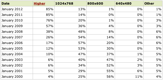
Screen Resolution
According to the chart below, 85% of web users have a resolution higher than 1024 x 768 (pixels). That 600 px fold is nearing extinction. Still, it is worth noting that the first generation iPad and the iPad 2, both of which enjoyed industry-changing sales records, display at 1024 x 768.
(Source: w3schools.com)
How important is the fold, really?
Immensely. However, not for the reason most commonly cited. Marketers miss out on the opportunity to tell a story and compel their users to take their desired action by trying to cram everything of note into the first 600 px of the site. The truth of the matter is that users are willing to, and most often do, scroll past the fold—if you give them a reason to (source: Clicktale.com). The purpose of the content placed above the fold is to give the user a reason to scroll to hear the whole story.
So, what’s the best way to give a user a reason to scroll down? The important thing is to make sure that you intrigue the user quickly with what I would like to call your “thesis”—preferably within the traditional top 600px. Tell the user what you are about in an interesting and compelling manner, and cue them—either by visual means, verbal means, or both—that there is a story worth scrolling for. Do these things, and chances are high that your users will spend more than 600 px with you.
SHARE THIS: