New mobile devices emerge every year, while existing ones are constantly being revamped and perfected. iPhones, Androids, BlackBerrys, iPads, Kindles, laptops and netbooks may have low resolution vs. high resolution screens, different browsers that interpret content their own way, orientations, speeds and compatibilities. Had enough? Let’s take a deep breath and analyze a better option.
Today, techniques in professional web design and development allow browsers to detect devices and their different screen sizes, resolutions and orientations using a Stylesheet method called “media queries.” This allows web designers to flex web content appropriately by detecting and adjusting the layout.
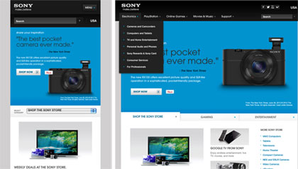
Responsive web design (RWD) conforms to a wide variety of devices making it easier for the user to access web content on the go. It eliminates long load times when performing basic functions and eliminates using a redirected link. All of this is done using one URL.
Having a single URL means that all of your links are directed within the same website and not a separate mobile site, and this is a good thing. From an SEO perspective, one URL can gather all links, PageRank, Page Authority etc. Also, Google analytics will give you a complete view of all traffic
SHARE THIS: